Area proportional to population maps
maps
R
data viz
Kenya
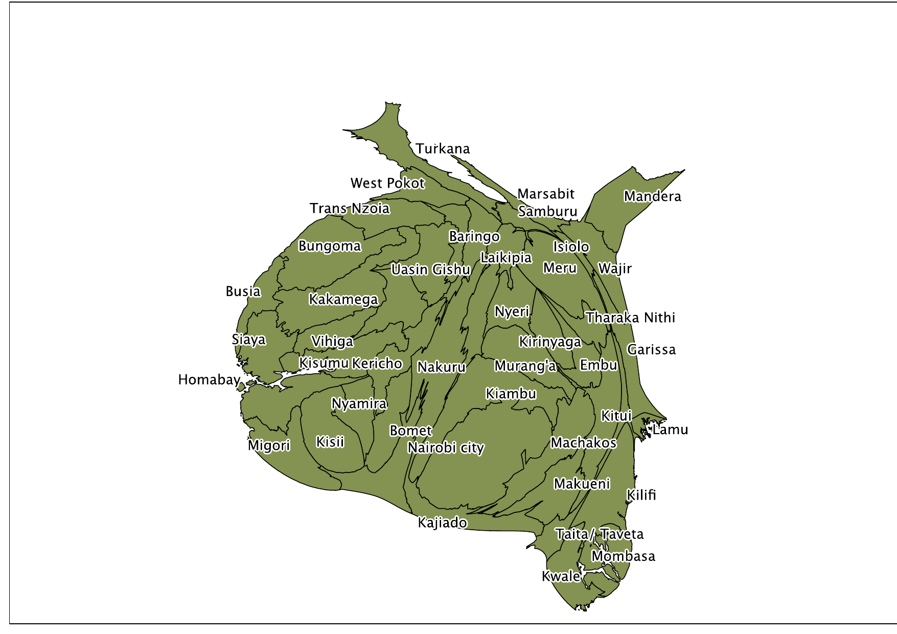
A density-equalizing cartogram of Kenya’s counties, with each county’s area proportional to its voting-age population.
Restored from my original WordPress blog (posted December 7, 2014).
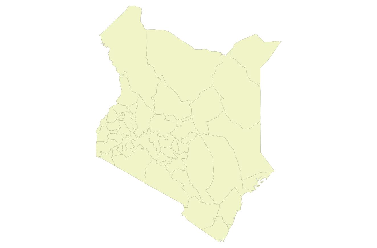
I was cleaning out my downloads folder, and I remembered I had made this cool map of Kenya that uses the algorithm of Scharl and Weichselbraun to make a density equalizing map of Kenya. This map shows each of Kenya’s counties with the area proportional to the voting-age population. You can see how unequal the county sizes are in the map.